
clickdummy
Make click-through prototypes from screen designs.
Prototype with screen designs
What is clickdummy?
clickdummy lets you create click-through prototypes from screens you design in a tool like Sketch or Photoshop.
Well, ususally you would do this with a third party solution like inVision. But sometimes you can't.
- You need a self hosted or local prototype, maybe due to NDA constraints.
- You want to quickly integrate an image-based prototype into an HTML prototype.
- You need a free solution for your prototype.
How it works
Download zip
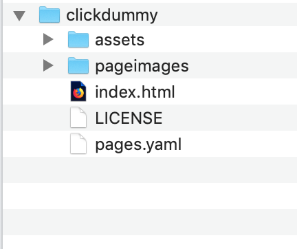
Setting up could not be easier:Download the zip file and unzip it.
🤩 Done! 🤩
After unzipping you'll see this:
Copy Images
Export your screens and move them into the pageimages folder: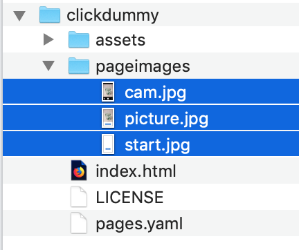
Define Pages
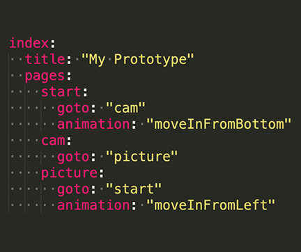
Open the file pages.yaml and edit the list of pages.The goto and animation parameters define what page will appear next and how.
Open Prototype
Open the file index.html in the Firefox browser

Features
- Link from one screen to the next
- Define hotspots for specific parts of the screen
- Use the in-built hotspot tool to get the hotspot coordinates
- Turn off click-through to work with hotspots only
- Define the dimensions of your prototype
- Use animations for page transitions
- Define custom headers either image-based or code-based
- Style code-based headers
- Use images as custom footers
- Use HTML inside clickdummy (e.g. to test forms)
- Integrate the clickdummy prototype into an existing HTML prototype
- Have multiple prototypes (e.g. for desktop and mobile) in the same instance of clickdummy
- Link to other documents or websites
- Home-Screen App: install the prototype as a Home-Screen App
Using clickdummy with Chrome, Safari & Edge
Using Firefox is the only way to use clickdummy without involving a webserver. All other browsers have technical restrictions that make it impossible for clickdummy to work without a webserver.Having a webserver has several advantages:
- The prototype will work in all modern browsers
- A remote webserver allows you to install a prototype on a mobile device as a Home-Screen App.
- Once it is here, auto-generating the YAML file will depend on clickdummy running on a webserver
MAMP is a free, local server environment that can be installed under macOS and Windows with just a few clicks.
Configuration Options
clickdummy Title
The parameter title defines the content of the html title tag. The parameter is optional, default title is clickdummy.index:
title: "My Prototype"
pages:
start:
goto: "cam"
animation: "moveInFromBottom"index:
title: "My Prototype"
pages:
start:
goto: "cam"
animation: "moveInFromBottom"
clickdummy dimensions
The default dimensions simulate the viewport of an iPhone 6/7/8. The default width is 375px,the height is 667px.You can set the dimensions with any valid CSS values for the parameters width and height.
index:
  width: "768px"
  height:"1024px"
  pages:
    start:
      goto: "cam"
      animation: "moveInFromBottom"
index:
width: "768px"
height:"1024px"
pages:
start:
goto: "cam"
animation: "moveInFromBottom"
Image File Type of the Screens
You can define your file type with the parameter imageFileType and set the ending of the file type. The assumption is that all your screens are of the same file type.The parameter is optional, the default file type is jpg.
index:
  imageFileType: "png"
  pages:
    start:
      goto: "cam"
      animation: "moveInFromBottom"
index:
imageFileType: "png"
pages:
start:
goto: "cam"
animation: "moveInFromBottom"
goto Parameter
The default behaviour of clickdummy is that users are taken to the next page when they click / tap on the current page. Each page in your clickdummy needs a goto parameter. This is the page which is loaded next.index:
pages:
start:
goto: "cam"
animation: "moveInFromBottom"
cam:
goto: "picture"
animation: "noAnimation"index:
pages:
start:
goto: "cam"
animation: "moveInFromBottom"
cam:
goto: "picture"
animation: "noAnimation"
animation Parameter
As a default clickdummy uses an animation when changing from one page to another. The default animation is moveInFromRightOther animations:
- moveInFromLeft
- moveInFromBottom
- moveInFromTop
- flipRight
- flipLeft
index:
  pages:
    start:
      goto: "cam"
      animation: "moveInFromBottom"
    cam:
      goto: "picture"
      animation: "noAnimation"
index:
pages:
start:
goto: "cam"
animation: "moveInFromBottom"
cam:
goto: "picture"
animation: "noAnimation"
neverAnimate Parameter
clickdummy animates page transitions by default. If you choose to not animate transitions as a default you can set the neverAnimate parameter to true.This is useful for prototypes that may not rely on transitions, like prototypes showing the desktop view.
index:
  neverAnimate: true
  pages:
    start:
      goto: "cam"
      animation: "moveInFromBottom"
index:
neverAnimate: true
pages:
start:
goto: "cam"
animation: "moveInFromBottom"
image Parameter
As a default clickdummy loads an image with the name of the page as a page background. You can specify the image for the page. This allows you to use the same image in different parts of your flow.Only specify the first part of the image name without the file-ending.
index:
  pages:
    start:
      image: "profileHome"
      goto: "cam"
      animation: "moveInFromBottom"
index:
pages:
start:
image: "profileHome"
goto: "cam"
animation: "moveInFromBottom"
Adding Hotspots
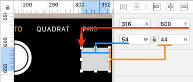
You can add Hotspots to a page. You can do this by defining rectangles and setting the goto page and the animationIf you work with Sketch, the easiest way to do this is by placing a rectangle where the Hotspot should be and then copy the parameters shown in the info section on the right.
You can have multiple Hotspots. The name of the Hotspot is up to you. It should only contain letters and numbers, without any whitespace.
index:
  pages:
    start:
      goto: "cam"
    cam:
      goto: "picture"
      hotspots:
        switchCam:
          top: "600px"
          left: "316px"
          width: "54px"
          height: "44px"
          goto: "camFront"
          animation: "flipRight"
index:
pages:
start:
goto: "cam"
cam:
goto: "picture"
hotspots:
switchCam:
top: "600px"
left: "316px"
width: "54px"
height: "44px"
goto: "camFront"
animation: "flipRight"
Using the Hotspot-tool to add Hotspots
Instead of adding hotspots manually by reading out coordinates, you can do this using clickdummy's hotspot-tool. The usage is straight forward:- Open your clickdummy prototype
- Go to the page you want to add hotspots to
- Press the h key to enter the hotspot editing mode
- Click where the top-left corner of the hotspot should be.
- When you move the mouse (you don't have to drag) you will see the area of the hotspot
- Click another time to set the bottom-right corner of the hotspot
- clickdummy automatically copies the coordinates to your clipboard
- Paste the coordinates into the pages.yaml file

Showing Hotspots
You can highlight the Hotspots. This is useful if you want to check if the Hotspots are placed at the correct position. You can permanently show Hotspots with the parameter showHotspotsAs an alternative you can reveal the Hotspots on the current page by pressing the option key (Mac) or the alt key (PC). On releasing the key the Hotspots lose their highlight.
index:
  showHotspots: true
  pages:
    start:
      goto: "cam"
    cam:
      goto: "picture"
      hotspots:
        switchCam:
          top: "600px"
          left: "316px"
          width: "54px"
          height: "44px"
          goto: "camFront"
          animation: "flipRight"
index:
showHotspots: true
pages:
start:
goto: "cam"
cam:
goto: "picture"
hotspots:
switchCam:
top: "600px"
left: "316px"
width: "54px"
height: "44px"
goto: "camFront"
animation: "flipRight"
Multiple Prototypes
You can have multiple prototypes in the same instance of clickdummy. This allows you to have prototypes in different dimensions, for example one for mobile and one for desktop.To achive this you have to do the following:
- Duplicate the index.html file and give it a letter-only name, e.g. desktop.html
- All images for all prototypes are placed in the pageimages folder.
- Add a new entry in the pages.yaml file like in the example
index:
  pages:
    startMobile:
      goto: "camMobile"
    camMobile:
      goto: "pictureMobile"
    pictureMobile:
      goto: "startMobile"
desktop:
  pages:
    startDesktop:
      goto: "camDesktop"
    camDesktop:
      goto: "pictureDesktop"
    pictureDesktop:
      goto: "startDesktop"
index:
pages:
startMobile:
goto: "camMobile"
camMobile:
goto: "pictureMobile"
pictureMobile:
goto: "startMobile"
desktop:
pages:
startDesktop:
goto: "camDesktop"
camDesktop:
goto: "pictureDesktop"
pictureDesktop:
goto: "startDesktop"
Linking to other documents
You can link pages of the clickdummy prototype to other documents or websites.This is done by leaving out the goto parameter and replacing it with a link parameter.
The value has to be a valid absolute or relative link, anything that works as a href attribute in an anchor tag (<a href="...">).
The new document will be loaded in the same window.
index:
  pages:
    start:
      goto: "picture"
    picture:
      link: "myOtherDocument.html"
index:
pages:
start:
goto: "picture"
picture:
link: "myOtherDocument.html"
Image-based Headers
You can add an image-based header to each page. The header will link to one page only. You can define the animation for the transition.The headers are sticky.
index:
  pages:
    start:
      goto: "category"
    category:
      goto: "product"
      animation: "moveInFromLeft"
      header:
        image: "headerBack"
        goto: "start"
        animation: "moveInFromLeft"
index:
pages:
start:
goto: "category"
category:
goto: "product"
animation: "moveInFromLeft"
header:
image: "headerBack"
goto: "start"
animation: "moveInFromLeft"
Image-based Footers
You can add an image-based footer to each page. The footer will link to one page only. You can define the animation for the transition.The footers are sticky.
index:
  pages:
    start:
      goto: "category"
    category:
      goto: "product"
      animation: "moveInFromLeft"
      footer:
        image: "footer"
        goto: "start"
        animation: "moveInFromLeft"
index:
pages:
start:
goto: "category"
category:
goto: "product"
animation: "moveInFromLeft"
footer:
image: "footer"
goto: "start"
animation: "moveInFromLeft"
Code-based Headers
You can add a code-based header to each page. Headers can have- A cell on the left: with either an icon or a label or both
- A cell in the middle for a title
- A cell on the right with a label
clickdummy comes with the ionicons icon library.
This is the full list of icons
Icons and running clickdummy locally without webserver (file:///)
clickdummy uses a webfont for the icons. Unlike other browsers Firefox comes with a restriction to load webfonts locally.
To get icons to work in Firefox:
clickdummy uses a webfont for the icons. Unlike other browsers Firefox comes with a restriction to load webfonts locally.
To get icons to work in Firefox:
- go to about:config in Firefox
- filter by fileuri
- toggle the preference security.fileuri.strict_origin_policy
- Set it to false and you should be able to see the icons.
index:
  pages:
    start:
      goto: "category"
    category:
      goto: "product"
      animation: "moveInFromLeft"
      header:
        navigation:
          left:
            icon: "ios-arrow-left"
            label: "Back"
            goto: "picture"
            animation: "moveInFromLeft"
          title: "A page title"
          right:
            label: "Edit"
            goto: "page4"
            animation: "moveInFromBottom"
index:
pages:
start:
goto: "category"
category:
goto: "product"
animation: "moveInFromLeft"
header:
navigation:
left:
icon: "ios-arrow-left"
label: "Back"
goto: "picture"
animation: "moveInFromLeft"
title: "A page title"
right:
label: "Edit"
goto: "page4"
animation: "moveInFromBottom"
Styling elements
clickdummy lets you set style properties for a few elements. This is useful if you plan to have codebased headers or html inside your prototype.You can define styles for all code-based headers. You can define whatever CSS property you want. The most important ones are:
- The background-color
- The text-color of the title
- The border-color at the bottom
Make sure that the keys of the properties are in camel-case: backgroundColor, not background-color.
Make sure that the values for the colors are in quotes.
Headers may contain links, which in turn might have a different color. To change that color you can add a entry "links" to the styles section.
index:
  title: "My Prototype"
  styles:
    page:
      color: "#fff"
      backgroundColor: "#000"
    headers:
      color: "#fff"
      backgroundColor: "#dd0000"
      borderBottomColor: "#000"
    links:
      color: "#ff0"
  pages:
    start:
      goto: "cam"
      animation: "moveInFromBottom"
index:
title: "My Prototype"
styles:
page:
color: "#fff"
backgroundColor: "#000"
headers:
color: "#fff"
backgroundColor: "#dd0000"
borderBottomColor: "#000"
links:
color: "#ff0"
pages:
start:
goto: "cam"
animation: "moveInFromBottom"
HTML on pages instead of images
clickdummy lets you use HTML for the pages. To do this add a div element into the div with the id htmlContainer.Give the div an id ("startpage" in the example) and add this id as the parameter "html" to the yaml file.
This only copies the html into the prototype. You will have to include additional CSS-files to the HTML-document to style the HTML.
Do this as you would with any other page in the header section of the HTML-Document.
index:
  title: "My Prototype"
  pages:
    start:
      html: startpage
    cam:
      goto: "picture"

############ HTML in index.html ############

<body>
    <!-- This helps you draw hotspots -->
    <div id="hotspotCanvas" class="hide">...</div>

    <!-- This is the container of the pages --->
    <div id="pt-main" class="pt-perspective"></div>

    <!-- This is the container for your html -->
    <div id="htmlContainer">
        <div id="startpage">
            Hello World
        </div>
    </div>
    ....
</body>
index:
title: "My Prototype"
pages:
start:
html: startpage
cam:
goto: "picture"
############ HTML in index.html ############
<body>
<!-- This helps you draw hotspots -->
<div id="hotspotCanvas" class="hide">...</div>
<!-- This is the container of the pages --->
<div id="pt-main" class="pt-perspective"></div>
<!-- This is the container for your html -->
<div id="htmlContainer">
<div id="startpage">
Hello World
</div>
</div>
....
</body>